01 / THE ARCHIVE BEFORE THE WEBSITE
SiteFerry began before it had a name, a dashboard, or any intention of becoming a product.
It began with an artist I shared a studio with.
I make pieces of my own on the side, and spending time around her work changed the way I saw it. She was always producing—sometimes several smaller pieces in a day, sometimes disappearing into one large work for much longer. What interested me was not only the volume. The work had color, movement, and a kind of instinct that felt unusually alive.
She had never built much of a public system around it. That made sense. Her attention was on making the work, not on turning it into a catalogue, a website, or a business operation.
I was interested in the other side of that equation.
I had been building websites and thinking about how businesses operate, so I asked whether she would let me create a site for her. I put together an early concept quickly—not a formal design system, not a finished identity, just enough of a page to make the possibility visible.
Then I looked at what the website would actually need to contain.
The missing layer
There were photographs of the work, but the photographs were not yet an archive.
They lived across folders and Google Drive without a consistent structure. Many did not have reliable titles, descriptions, dates, media, dimensions, collection assignments, or any of the other information a serious catalogue would eventually need.
I could have continued designing around that disorder. The homepage might still have looked convincing. A few selected images could have made the project feel further along than it was.
But every page after that would have inherited the same problem.
Search would be unreliable. Collections would be arbitrary. Replacing an image would require another conversation. Adding new work would depend on whoever remembered how the last work had been added. The site might launch, but the system behind it would already be breaking.
So I stopped the website.
I told her that if we were going to do it, we needed to build the archive first.
Turning a body of work into usable information
Notion became our shared operating space. We began giving the work enough structure to be understood by something other than memory: titles, dates, media, descriptions, collection logic, images, and the editorial decisions that connected them.
That process was larger than a content-entry task. It was the first architecture of the project.
The preserved records begin in September 2025. Over time, the archive split into several working views and collections. A legacy artwork database contains 406 records. A later current database contains 423. A separate Visual Symphony archive contains 279 records organized around a more interpretive experiment.
Those databases overlap, so I do not treat their totals as a count of unique works. The more important point is that the project had crossed from a folder of images into a maintained information system.
Each field changed what the future website could do.
A date could become a decade filter. A medium could become a collection route. A status could determine whether a work was public, unavailable, or held back. A stable image and record identity could eventually travel through a production database, an editing system, a preview, and the public site without someone rebuilding the page by hand.
The interface had not disappeared from the work. It had simply moved downstream.
The first principle
The archive taught me the principle that would later shape SiteFerry:
A website cannot become a reliable source of truth when the information beneath it has no reliable shape.
At the time, I was not trying to invent a CMS. I was trying to do right by one artist and avoid building a polished surface over an operating problem.
But that decision changed the entire project.
Once the work had structure, the website could stop guessing. It could begin to respond to the collection itself.
And that made a much stranger experiment possible.
02 / THE VISUAL SYMPHONY
What if a gallery asked you to stay?
Once the archive had enough structure, I could stop thinking about the work as a folder of images and begin thinking about how someone might experience it.
Most websites ask us to move quickly. A grid presents everything at once. We scan, select, return, and continue. Even good work can become another thumbnail competing for a few seconds of attention.
That behavior felt wrong for this collection.
The pieces were bright and full of movement. Their color relationships seemed to change depending on which work came before or after them. I was already listening to a great deal of classical music, and one day the connection became obvious to me: I did not want to build only a gallery. I wanted to see whether a group of images could be experienced more like a composition.
That became The Visual Symphony.
An interpretive system
I began reviewing works one at a time and assigning qualities that helped me reason about how they might live together.
Some suggested a particular tonal center. Others felt fast, suspended, heavy, quiet, or unresolved. I recorded ideas such as key or tone, tempo, mood, chromatic quality, movement order, duration, and the music that might accompany a sequence.
This was not an attempt to claim that an image objectively belongs in D major, or that color can be translated into music through a universal formula.
It was a curatorial method.
The metadata gave intuition a structure. Instead of saying that several pieces simply “felt right” together, I could compare the qualities I was responding to, assemble a movement, test its pacing, and decide whether the transition into the next work held together.
The preserved Symphony archive contains 279 records. Some belonged to experiments, alternative groupings, or overlapping sequences rather than one finished public programme. The scale matters because the experience was not designed around three convenient demo images. It grew from repeatedly reviewing a real body of work and trying to understand its internal relationships.
Building time into the interface
The interface was built as a custom audio and visual player rather than a standard gallery template.
A visitor could enter a Symphony, select a movement, and allow the sequence to unfold. Music played through an integrated audio layer. Images advanced according to the movement order. Transitions faded between works. Timing and duration were part of the presentation, and the interface responded to the audio state rather than treating sound as an unrelated background file.
The system included:
- movement-specific audio and descriptive metadata
- ordered sequences of selected works
- automatic progression from one movement to the next
- controlled visual fades between images
- fullscreen presentation
- playback and navigation controls
- an audio analyser used to translate playback state into subtle visual response
In spirit, it borrowed some of the clarity of a music library, but the experience itself was built for this project. The artwork was not decoration for a player. The player existed to control the conditions under which the artwork was encountered.
That distinction changed the design.
Instead of giving the visitor every option immediately, the interface could ask for a little patience. It could hold one image long enough for another detail to become visible. It could make the next work feel like an arrival rather than another click.
The useful excess of an early idea
The first artist website grew around that energy. It was expressive, immersive, and more playful than the system that followed it.
I still think the Symphony was a strong idea. It proved that the archive could produce experiences rather than simply populate pages. It forced me to solve sequencing, audio state, visual transitions, collection logic, and the relationship between structured content and a custom interface.
But several months later, I began to see a problem.
The work already carried a great deal of color, motion, and personality. The website was adding another layer of color, motion, and personality around it. Instead of creating contrast, the interface was sometimes repeating the same emotional register as the work.
The experience asked the visitor to notice the design at the same time it asked them to notice the art.
For a special collection, that theatricality could be meaningful. As the main language of the artist’s entire website, it was becoming too much.
Learning what not to preserve
Removing the Symphony from the center of the later website was not an attempt to erase the earlier work.
It was a product decision made after living with it.
The experiment had already done its job. It exposed the depth of the archive, proved that the content model could drive something highly custom, and showed me that simplicity is not the absence of complexity. Sometimes it is the result of deciding which complexity belongs behind the surface.
The next website would become much quieter.
The database, sequencing logic, media preparation, and operational discipline would remain part of what I had learned. But the public frame would step back. White space would replace spectacle. The work would provide the movement. The interface would provide orientation.
That shift became one of the most important decisions in the entire SiteFerry story.
Before I could build a system that gave clients controlled ownership of their websites, I first had to understand when a system should be visible—and when it should disappear.
03 / WHEN THE FRAME BECAME QUIETER
The simpler it looked, the more carefully it had to work.
The first website had been designed to create an experience around the work.
The next one was designed to get out of its way.
That sounds like a visual decision, but it began as a question of hierarchy. The artwork was already expressive. It contained its own rhythm, color, imbalance, humor, and movement. When the interface answered with more movement and personality, the two began competing for the same attention.
I wanted the work to feel more serious without making it feel cold.
So I changed the role of the website.
Instead of behaving like another composition, it would behave more like a well-run gallery: present, precise, and calm enough that the visitor notices what has been placed inside it.
Redesigning the frame
The new direction used a nearly white canvas, restrained typography, generous negative space, and navigation held toward the edges of the page. The center was left open for the work.
There was no need for a decorative interface to announce that the website had been designed. The decisions could be felt through proportion, spacing, image treatment, and the absence of unnecessary controls.
The layout used left and right areas for orientation while protecting a larger central field. On artwork pages, filters and collection context could remain available without turning the image into one tile among many. On editorial pages, the same structure could hold biography, practice, exhibitions, and supporting information without inventing a different visual language for every route.
This was not minimalism as a style applied at the end.
It was a rule for deciding what belonged on the screen.
Consistency had to replace decoration
Removing visual noise makes weak decisions easier to see.
When a page contains fewer elements, inconsistent spacing becomes more obvious. Typography carries more responsibility. A misaligned label, an image that changes scale unpredictably, or a navigation item that shifts between pages can disturb the entire composition.
So the redesign had to become more systematic than the version it replaced.
The preserved development history shows the website being rebuilt around an explicit foundation: color roles, type scales, spacing rules, navigation behavior, artwork-viewer geometry, contact controls, semantic states, and responsive expectations. These were documented as a shared canon rather than corrected independently on every page.
The system established rules for questions such as:
- how far content begins from the viewport edge
- how navigation aligns across routes
- how body text and artwork metadata relate in scale
- how much space separates a title, supporting line, and primary content
- how an image behaves when its proportions differ from the one before it
- what information remains visible on smaller screens
- which controls are persistent, contextual, or removed entirely
The result is intentionally quiet. The work required to keep it quiet is not.
A simple surface over a larger operating system
By this point, the website was no longer drawing from an informal folder.
Notion remained the editorial workspace where material could be gathered, described, reviewed, and prepared. Supabase became the structured production catalogue and approved-media layer. The website rendered that production data through a controlled presentation system, and Vercel carried the deployed application.
The path between those systems was deliberately more careful than I first described it to myself.
Notion did not simply push everything directly into the public website. Editorial records had to be checked, reconciled, and transferred into sources that could support stable identifiers, predictable media, and production-safe rendering. Temporary attachment links could not become permanent website dependencies. A record that looked complete to a person still needed to satisfy the application’s expectations.
The working path became:
Editorial intake → validation and reconciliation → production catalogue and media → website rendering
That separation protected both sides.
The artist could continue working in a familiar editorial space. The public application did not need to trust every temporary field, attachment, or unfinished record as production-ready content.
Designing for a collection that would keep changing
The website could not be treated as a static portfolio because the collection itself was not static.
New work continued to arrive. Existing photographs could be replaced. Titles and descriptions could change. A work might move between public and private states, enter a collection, leave one, or require new presentation rules. Every change created a relationship between editorial information, production data, media storage, application behavior, and the deployed site.
The visible interface needed to remain stable while the material inside it continued to evolve.
That is where the project stopped being only a website for me.
I was now maintaining an operating relationship among a person, an archive, a database, and a custom application. The quieter the public site became, the clearer that relationship was.
The hidden cost of keeping it quiet
The redesign succeeded visually. The artist liked it. I liked it. The work finally had the kind of space I believed it needed.
But the new system exposed another problem.
Whenever a photograph needed to be replaced, a description corrected, or new work prepared for the site, I was still the person connecting every layer. A small request might require only a small visible change, but it still meant leaving whatever I was building, finding the right record, checking the media, updating the production source, confirming the result, and making sure the website remained intact.
The site looked effortless because the effort had moved behind it.
That arrangement could work for one project while I was close to every detail. It would not scale across future clients, each with their own content, requests, and publishing rhythm.
The next question was no longer how the artist’s website should look.
It was how much of that operating responsibility could safely leave my hands without handing over the architecture with it.
04 / WHEN THE WORK KEPT MOVING
The website needed a way to move with it.
The redesigned website was live, but the work it represented did not become still.
New pieces continued to appear. Some days brought several. A better photograph might replace an earlier one. A title could become clearer after the artist had lived with it. A description, project, or collection could develop as the work around it developed.
That movement was not maintenance in the dull sense of keeping an old website alive.
It was the practice continuing.
Our collaboration made that visible. She stayed close to the work itself, and I stayed close to the system forming around it. When something changed, we could discuss it, understand where it belonged, and make sure the website continued to represent it honestly.
The relationship was working.
The handoff model was not finished yet.
A living collection has an operating rhythm
A custom website can appear complete on launch day. A living archive cannot be complete in the same way.
Every new or revised piece travels through a quiet sequence of decisions:
- Identify the correct work and its place in the collection.
- Confirm the image, title, description, media, dimensions, and other approved information.
- Prepare the file for its production environment.
- Update the structured record without disturbing unrelated fields.
- Render the change inside the real website.
- Review the result across the relevant screen sizes.
- Publish or revalidate the affected experience.
- Confirm that the public result reflects what the artist intended.
When that process works, it should feel simple to the person making the work. The complexity belongs in the system, not in her day.
But I was still the only route through the system.
She could organize and prepare information with me in the archive, yet she could not safely carry an approved change through draft, preview, and publication herself. The website relied on our collaboration, but its tooling had not caught up to how that collaboration actually worked.
The client should not need to become the developer
The obvious answer would have been to give her access to everything.
That would not have been a useful kind of independence.
She did not need to learn components, repositories, deployment states, routes, database contracts, or design tokens. Those systems existed to support her work; they should not become another practice she had to manage.
What she needed was narrower and more practical: a clear way to update the information that belonged to her, understand what the change would look like, and move it forward without risking the rest of the website.
This changed the question from “How do I give a client access?” to something more precise:
Which decisions already belong to the client, and how can the product make that ownership safe?
That question respected both sides of the relationship.
The artist remained the authority on the work and the information surrounding it. I remained responsible for the architecture that presented it. Neither person needed the other’s job. We needed a controlled route between them.
Finding the boundary
I began separating the website into two kinds of ownership.
The client should control:
- approved copy
- approved images
- descriptions and metadata
- the state of a draft
- the decision to request or complete a publish
The developer should continue controlling:
- layout and components
- design-system rules
- application code
- routes and data contracts
- infrastructure
- credentials and secrets
This was not about withholding control. It was about matching authority to responsibility.
A client changing the description of her own work is not the same kind of action as changing the component that renders hundreds of records. Replacing an approved image is not the same as receiving access to the storage credentials beneath it. Publishing reviewed content is not the same as controlling the deployment platform.
Once those actions were separated, the shape of the missing product became clearer.
Designing the next part of the collaboration
The new system needed to feel closer to the way we already worked together.
It should give the client a calm, understandable surface. It should show only the fields we had agreed were editable. It should preserve drafts, make the real result visible before publication, and keep a history of what changed. It should allow the website to keep moving without requiring either person to surrender the part of the work they understood best.
For me, that also created a better foundation for future client relationships. I could stay involved in design, architecture, and meaningful product decisions without remaining the only person capable of carrying every content change to completion.
The goal was not to reduce the relationship.
It was to remove avoidable dependency from it.
By the time I understood that, the first product brief was almost plain language:
Give clients a calm place to manage the content they own. Let them save a draft and see the real result before it becomes public. Keep the codebase and design system protected. Make publication deliberate. Leave a history of what changed.
It did not need to be a visual builder. It did not need a marketplace, a plugin ecosystem, or every capability of a traditional CMS.
It needed to make one important handoff work well.
The first name I gave that system was DevPort.
Its first principle was even simpler:
Clients control content. We control architecture.
05 / DEVPORT
The narrowness was the point.
On May 23, 2026, the handoff idea became a separate product.
The first repository was called DevPort.
I was not beginning with a plan to compete feature for feature with established content-management systems. I was taking one repeated condition from real client work and giving it its own boundary.
A developer builds a custom website. The client owns the information inside it. The client should be able to keep that information current. The developer should not have to surrender the structure that keeps the website coherent.
That was enough to begin.
A soft CMS
I started calling DevPort a “soft CMS.”
The phrase was useful because it described what the product intentionally did not try to become.
A traditional CMS can be the center of an entire publishing operation. It may manage page structure, templates, permissions, plugins, workflows, content models, media, localization, and presentation across many channels. That breadth is valuable when the organization needs it.
My clients did not need all of it.
They needed a calm surface for the changes they actually made: replace an approved image, revise a sentence, update descriptive information, save the work, see the result, and publish it safely.
DevPort would sit above a custom-coded website rather than replace its architecture.
It would expose an approved editing surface and keep everything else closed.
Defining the boundary before the interface
The first foundation document was written before the product had matured visually.
Its central rule was:
Clients control content. We control architecture.
That sentence became a design constraint.
If a field was not intentionally approved, the client should not see it as editable. If an image belonged to a protected part of the presentation, the editor should not pretend it was interchangeable. If a change could affect the layout, application behavior, or deployment environment, it belonged outside the client surface.
The boundary was not based on whether a control was technically possible to expose.
It was based on whether exposing it matched the client’s responsibility.
The early product allowed for:
- approved copy and image editing
- alt text and selected metadata
- draft states
- preview before publication
- deliberate publishing
- a record of what changed
It excluded:
- visual page building
- layout and component editing
- arbitrary code access
- infrastructure and deployment control
- credentials and secrets
- unrestricted repository changes
This made DevPort smaller than a general CMS by design.
It also made the promise easier to understand.
Documentation became part of the build
The repository did not begin with interface work alone.
On the first day, I established the application foundation, the product doctrine, the early brand system, the dashboard direction, deployment and domain work, authentication, and a documentation-first operating structure. The following day added repository connection, database and membership foundations, and the first billing integration.
The early stack centered on Next.js, TypeScript, Tailwind, GitHub, Vercel, structured content, authentication, and a relational application database.
But the more important decision was how the work would stay coherent while it grew.
Every meaningful capability needed a written contract: what the feature was for, who could use it, what it was allowed to change, what happened when it failed, and how we would know whether it worked.
That documentation was not written after the software to make the repository look organized. It became the memory and decision layer used to build the software itself.
As the project expanded, those records helped prevent an early client tool from drifting into a vague collection of dashboard features.
The doctrine could keep asking the same question:
Does this help a client manage approved content without weakening the website’s architecture?
If the answer was no, the feature did not belong in the first product.
Making a safe change visible
The editor needed to make the difference between “saved” and “live” obvious.
A draft was not a published change. A successful validation was not a deployment. A payment event was not permission to change the website. A publish request was not complete merely because the user pressed a button.
The product therefore began separating actions that many interfaces collapse together:
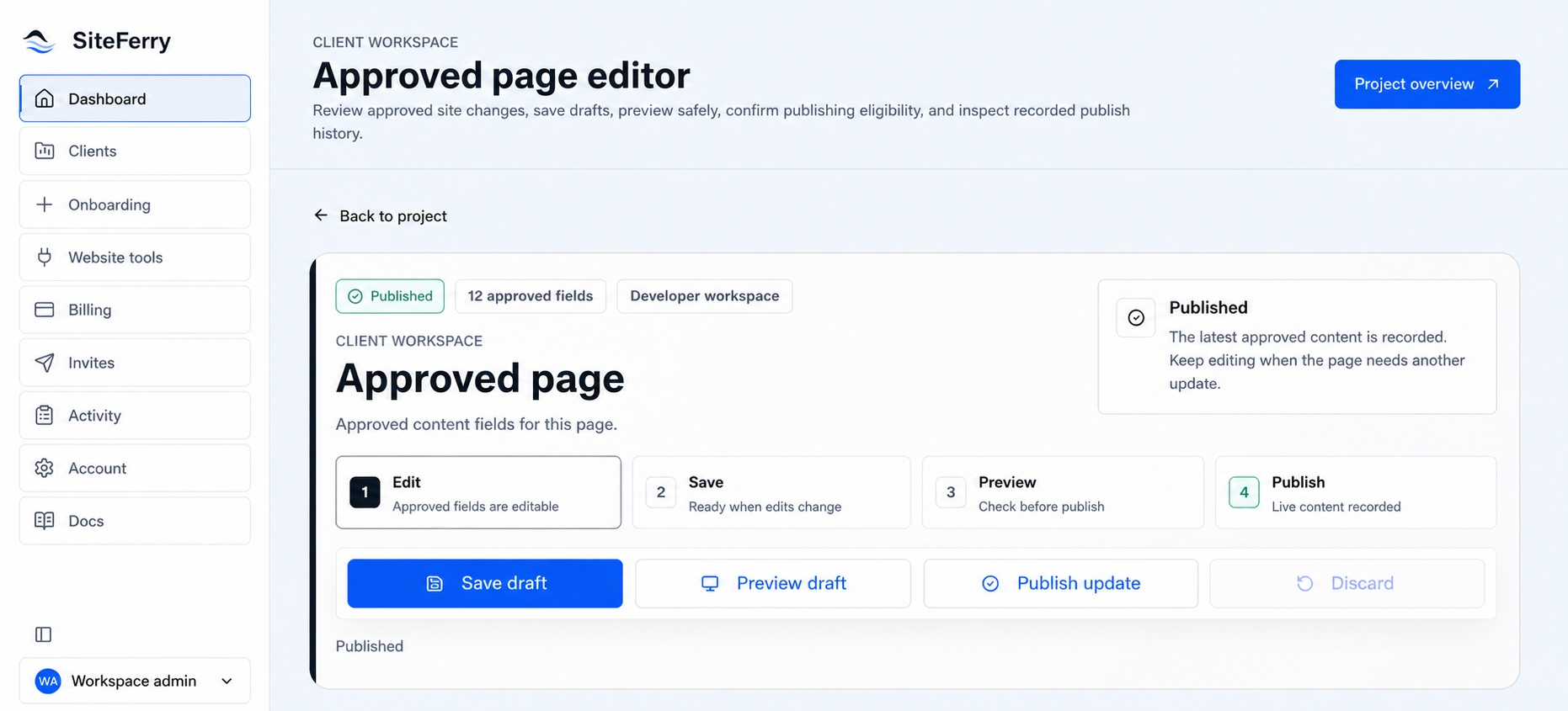
Edit → validate → save draft → preview → publish → confirm
That sequence created space for trust.
The client could work without the fear that every keystroke was altering the public site. The developer could define what a valid change looked like. Both could inspect the real presentation before publication. If something downstream was still processing or uncertain, the interface could say so rather than inventing a successful result.
This was the beginning of what would later become exact preview, revision history, provider readiness, and controlled publishing operations.
The first real proving ground
In early June, DevPort began connecting back to the artist system that had inspired it.
The product gained a Supabase content adapter, reusable artwork-gallery logic, editor and synchronization surfaces, and a working path into the real catalogue. The theory was now being tested against hundreds of structured records rather than a clean demonstration project.
That mattered.
A generic text field is easy to make editable. A real catalogue has identity, media, statuses, relationships, incomplete records, presentation requirements, and consequences when the wrong change reaches the public site.
The artist workflow forced DevPort to respect those conditions.
It also began turning one client-specific solution into a reusable system. The product could understand approved fields without becoming the website itself. It could coordinate a content provider without owning the public rendering layer. It could create a safer route between the person responsible for the content and the application responsible for presenting it.
The original problem was beginning to hold beyond the original project.
A product with the wrong-sized name
DevPort was becoming more capable, but its name still described the system from my side of the relationship.
It sounded like a place for developers. The product itself was becoming a route between developers, clients, content, and a live website.
The domain problem made that tension impossible to ignore. The best DevPort address was unavailable on practical terms. MyDevPort was workable, but the word “My” made the product feel smaller and more temporary than the system it was becoming.
I could have treated that as a branding inconvenience and continued.
Instead, I used it as another product question.
If the system was no longer merely a developer’s portal, what was it actually helping move from one side to the other?
06 / BECOMING SITEFERRY
The name explained the movement.
DevPort had given the product a working identity.
It also revealed where the identity was too narrow.
The name described the system as a destination for developers: a port where a developer might manage projects, clients, or content. That was part of the product, but it was not the whole relationship.
The client was not arriving at a developer tool to become a developer.
The website was not being rebuilt inside the platform.
What the product really provided was a controlled route between two sides that needed to remain distinct.
When the domain problem became useful
I originally wanted a clean DevPort domain, but the practical options were unavailable or priced beyond what made sense for the product at that stage. I used MyDevPort while I continued building.
It worked as an address. It did not resolve the identity.
“My” made the name feel like a personal utility. “DevPort” kept the developer at the center. Meanwhile, the product was becoming less about a dashboard I used and more about how a custom website could pass safely into an ongoing client relationship.
The domain constraint forced me to reconsider a name I might otherwise have kept through momentum.
That was useful.
Naming can expose a product that has outgrown its original explanation. If the name keeps requiring a paragraph of correction, the problem may not be the audience. The name may still be describing an earlier version of the idea.
The handoff was not a transfer of everything
I began looking for language around movement, custody, boundaries, and handoff.
The product needed to move approved content and publishing authority without moving the entire codebase. It needed to let the client cross into a useful operating role while the underlying architecture stayed where it belonged.
That is why “ferry” fit.
A ferry does not dissolve the two sides it connects. It creates a known route between them.
It carries a specific passenger or object across a boundary, under defined conditions, and delivers it without pretending the water between the two places has disappeared.
SiteFerry could do the same for a custom website:
- carry approved content from draft toward publication
- carry a client into a bounded editing role
- carry a developer-built site into a maintainable operating relationship
- preserve the separation between content ownership and technical architecture
The metaphor was simple enough to remember and accurate enough to keep revealing the product.
On June 19, 2026, I purchased the SiteFerry domain.
Ferry, not fairy
The name came with an obvious risk.
Spoken aloud, SiteFerry could be heard as “site fairy”—something magical that makes website work disappear.
That was not the product I wanted to imply.
There was no magic in the system. Its value came from explicit permissions, approved fields, visible states, validation, provider contracts, and a controlled publishing path. Calling that magic would hide the very decisions that made it trustworthy.
So the brand direction established a clear rule: the useful metaphor was the ferry, never the fairy.
Even then, the product did not need ships, waves, anchors, ropes, or a nautical costume. The metaphor should live in the structure and language of the experience—not in decorative graphics trying to make the name obvious.
The visual system remained calm, precise, and mostly neutral. Black, white, gray, restrained typography, clear status color, and generous space made the interface feel operational rather than promotional. The product could be warm without becoming cute.
A better point of view
The name changed the subject of the product.
DevPort had been “my place to manage the client’s website.”
SiteFerry became “the route through which developer, client, content, and website can work together safely.”
That is a larger idea, but it did not require a larger feature list.
The product still had to remain narrow. A ferry is useful because its route is defined. If it tries to become every kind of transportation at once, the clarity disappears.
SiteFerry would support specific website architectures, specific providers, and specific editable fields. It would make those supported paths understandable and reliable before claiming universal compatibility.
This principle would later become important when I began considering other developers. The name had room for that future without pretending the product could already connect every framework, repository, database, storage provider, and deployment system.
A name creates a promise
Purchasing the domain did not complete the rebrand.
Authentication, interface language, account states, documentation, deployment configuration, product surfaces, and the live client workflow all had to move with it. The repository records that transition over the following days as SiteFerry became the product’s actual operating identity rather than a name placed over DevPort.
More importantly, the name now made a promise that the software had to prove.
If SiteFerry claimed to provide a controlled crossing, the route had to be visible.
The client needed to know what she could edit. A draft needed to remain distinct from the live site. Preview needed to show the real destination. Publishing needed to report what the downstream systems were actually doing. Access needed to stop at the correct organization, project, and field. Every important transition needed a record.
The metaphor had become an architecture test.
The next stage was to make the full crossing work with a real client, a real catalogue, and a real website on the other side.
07 / THE WORKING CLIENT SYSTEM
The client got control without getting the machinery.
The first complete SiteFerry route returned to the artist whose archive had started the entire project.
By then, the public website, the production catalogue, the editorial archive, and the editing platform were separate systems with separate responsibilities. Making them feel simple to the client required those boundaries to become more explicit—not less.
The goal was straightforward:
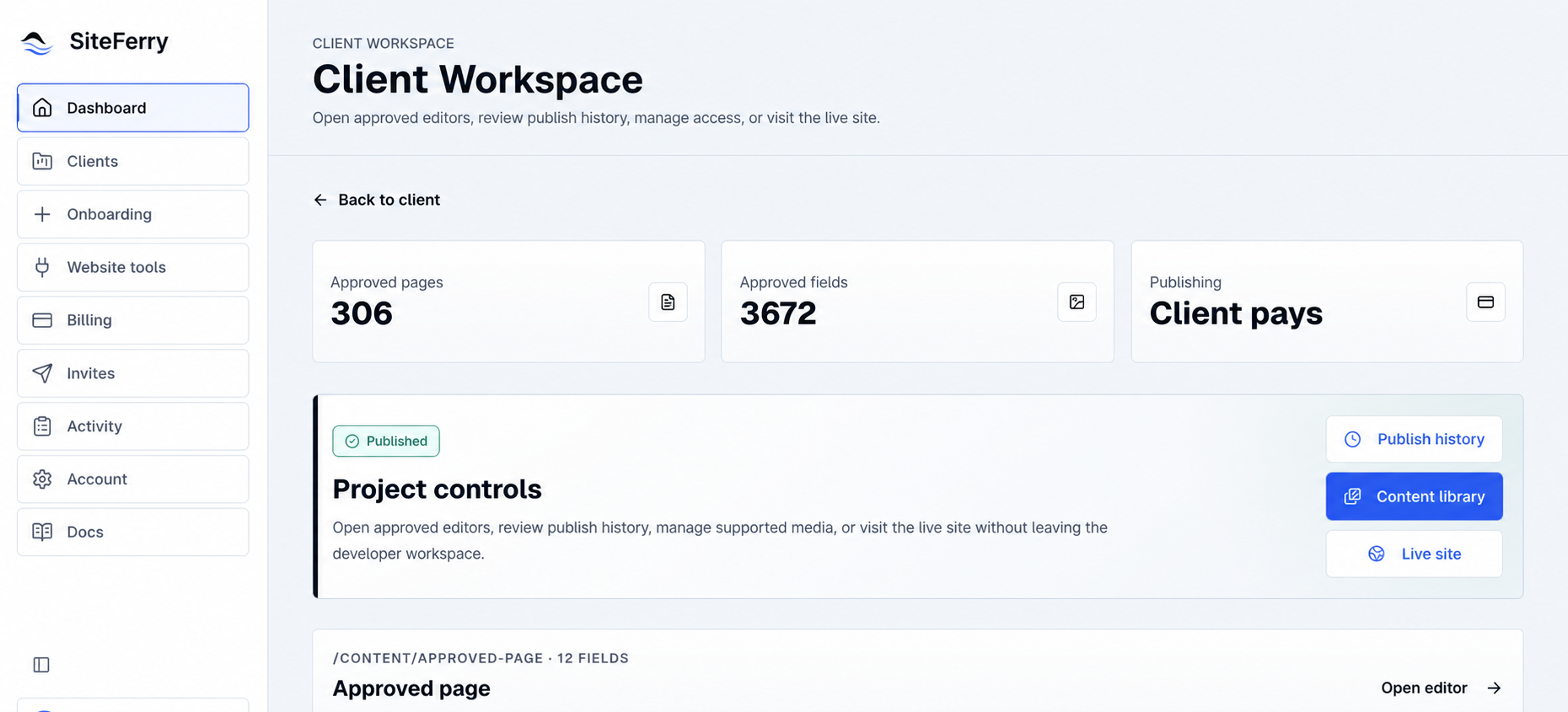
She should be able to enter SiteFerry, find one of her records, change approved information, save it, see the real website with the draft applied, and publish when the result was right.
She should not need to know which database table stored the record, which application rendered the page, which provider held the image, or which route needed to be revalidated.
The system should know.
Access begins with context
SiteFerry does not begin by showing every user the same dashboard and deciding later what they can touch.
Access is resolved through an organization, a membership, a workspace, a project, and an assigned client relationship. That context determines which site the person belongs to, which records are available, and which actions are permitted.
For the artist workflow, the editing surface is built from an allowlist rather than an open database browser.
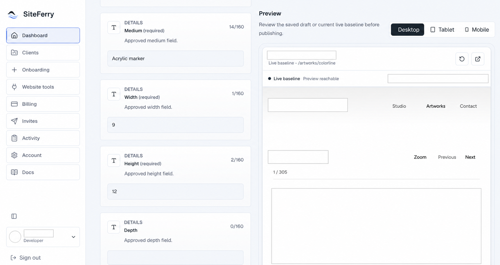
Each artwork can expose twelve approved fields. Those fields cover the parts of the record the client is responsible for maintaining while keeping the application’s protected structure outside the editor.
One early acceptance checkpoint mapped 67 active records across those twelve fields, producing 804 approved field bindings. As the integration matured, the current working catalogue baseline expanded to 305 real records plus one private test fixture.
The numbers are not presented as a measure of success by themselves. They show why the permission model mattered. A casual prototype can hard-code a form for one record. A working client system has to preserve the correct boundary repeatedly across hundreds of records without quietly granting broader control.
Four systems, four jobs
The working architecture became easier to reason about once each system had one clear responsibility.
SiteFerry owns the relationship and the workflow:
- authentication and membership
- client access
- approved-field definitions
- drafts and revisions
- validation
- exact preview coordination
- publishing operations
- visible history
Supabase owns the production catalogue and approved web media:
- canonical artwork records
- stable identifiers
- structured content
- production image assets
- provider-side update and revalidation behavior
The custom website owns presentation:
- the public layouts and components
- responsive rendering
- design-system rules
- the signed preview consumer
- the final visitor experience
GitHub owns the application code and migrations:
- source history
- architecture changes
- schema evolution
- reviewable implementation records
Notion remains upstream as the familiar editorial workspace. New material can be gathered and prepared there, but it must pass through validation and reconciliation before it becomes production website data.
No single system pretends to own the entire operation.
That separation is what allows the client experience to remain narrow.
A draft is allowed to be unfinished
When the client changes an approved field, SiteFerry does not immediately alter the public website.
The change becomes a revision associated with the correct organization, project, page, field, record, and user. It can be validated and saved as a draft while the public site remains untouched.
This sounds like ordinary editor behavior, but it changes the emotional quality of the product.
The client is allowed to think inside the system.
She can revise a sentence, reconsider it, replace an image, or return later without treating every interaction as a public event. The product does not convert access into pressure.
The draft also gives the system a stable object to inspect. SiteFerry can compare it with the current production value, preserve its revision history, and carry the exact proposed state into preview.
Preview means the real destination
A generic preview card would not have been enough.
The artist’s website has its own typography, spacing, image behavior, navigation, and responsive rules. A text field rendered inside the SiteFerry dashboard cannot reveal whether a title wraps badly on the real page or whether a replacement image changes the visual balance of the composition.
Exact preview sends the approved draft through a signed preview boundary and renders it inside the real website contract.
The client can inspect the proposed change beside the editing surface and switch among desktop, tablet, and mobile views. The production record remains unchanged while the public application renders the draft as if it were present.
That is the moment the two sides of SiteFerry meet:
The client sees the content she controls inside the architecture the developer controls.
Neither side has to be simulated by the other.
Publishing is an operation, not a button state
When the draft is ready, SiteFerry can create a publish operation through the configured provider path.
For the artist site, that path updates the approved production data and requests the website behavior required to make the new state visible. The operation records what was requested, who requested it, which revision was involved, and what the downstream system reported.
The interface does not declare success merely because the button was pressed.
Publication can move through states such as requested, processing, confirmed, or uncertain. If a provider has accepted the operation but final visibility cannot yet be established, the product should preserve that uncertainty rather than tell the client something it does not know.
This distinction shaped the billing boundary as well. A checkout attempt is not a publish operation, and completing payment does not silently make a draft public. Billing, access, drafting, preview, and publication remain related but separate events.
Trust comes partly from what the system refuses to collapse.
History makes the handoff reviewable
Every important transition leaves a record.
Invitations, access changes, drafts, revisions, provider readiness, publication attempts, and final states can be understood after the immediate interaction has passed. That history gives the developer an operational view without requiring the client to read infrastructure logs.
It also gives the collaboration a shared reference.
If something appears differently than expected, the conversation does not need to begin with memory. The product can show which record changed, which revision was previewed, what was published, and what the provider returned.
The history is not there to monitor the client.
It is there to make the system accountable to both people using it.
The outcome was ordinary in the best way
The artist now uses SiteFerry as part of the website relationship.
She has told me that she loves the product and, especially, that she no longer has to reach out every time she wants to handle a routine change.
That is the clearest confirmation of the original idea.
She did not have to become a developer. I did not disappear from the relationship. We still have the conversations that deserve collaboration—new projects, presentation decisions, unusual content, and the direction of the site.
The routine path simply stopped requiring permission from the wrong person.
The result is not dramatic when it works. A client signs in, changes something she owns, sees it accurately, and moves it forward.
That ordinary experience rests on the archive, the permissions, the provider contracts, the preview boundary, the publication state, and the history beneath it.
SiteFerry had completed its first real crossing.
But I had configured much of that route myself.
Making the system work for one client proved the product. Making it usable by another developer would require turning my decisions into an onboarding process someone else could understand and trust.
08 / FROM ONE WORKFLOW TO A DEVELOPER PRODUCT
The product worked. The setup was still mine.
The artist’s workflow proved that SiteFerry could create a useful boundary among a developer, a client, a content system, and a live custom website.
It also exposed how much knowledge I had carried into the integration myself.
I knew how the website was structured because I had built it. I knew which records belonged to which pages, which fields were safe to expose, which provider held the content, how preview should be rendered, and what publication meant for that application.
Turning that knowledge into a working SiteFerry configuration took me roughly six to seven hours, even with a coding agent assisting me.
That estimate is my own experience, not a product benchmark. Another repository could be easier or much harder.
But it identified the next constraint clearly.
SiteFerry could not become a product for other developers if every integration depended on me personally reconstructing their website.
The setup needed its own architecture
The first developer-onboarding work tried to make that process explicit.
The repository gained setup plans, provider definitions, compatibility checks, approved-field selection, safe repository inspection, invitation structures, and proof records. It explored how a developer could move through a sequence rather than arrive at an empty dashboard and guess what SiteFerry needed.
That work was substantial. It established useful contracts and proved that many parts of onboarding could be represented, tested, and reviewed.
It also belonged to an earlier product direction.
As the next phase was examined more closely, the problem changed from “How can SiteFerry inspect and configure a repository?” to a more important question:
How little repository access should SiteFerry require in the first place?
The answer led away from a cloud service asking for broad source access and toward a local-agent-first architecture.
Bring the agent to the repository
In the approved Partner Beta direction, the developer brings a coding agent already capable of understanding the project locally.
That might be Codex, Claude Code, Cursor, or another compatible agent operating through the developer’s own provider account.
SiteFerry does not ask for the developer’s AI key. It does not pay for or meter the developer’s model usage. Most importantly, it does not require the repository’s source code to be copied into SiteFerry merely so the platform can inspect it.
The agent works where the repository already lives.
SiteFerry provides a narrow setup contract. The local agent inspects the project, reports structured progress, prepares a proposed integration manifest, and returns verification receipts. The developer reviews and approves what is being proposed before the product accepts it as configuration.
The intended boundary is:
LOCAL REPOSITORY → DEVELOPER'S AGENT → APPROVED MANIFEST + STATUS + VERIFICATION → SITEFERRY
Source stays local. Authority stays bounded. The developer remains in the decision path.
Narrow tools instead of general access
The approved MCP design contains nine purpose-specific tools for the setup journey.
Their job is to establish the session and contract, report preflight and progress, submit a proposal and approved manifest, return verification, and create a support record when the safe path cannot continue.
What the MCP is not allowed to do is more revealing.
It has no general repository browser, arbitrary file access, shell execution, or open-ended external URL tool. It cannot connect a production provider, start checkout, publish content, remove a member, restore data, disconnect a site, or complete offboarding.
Those exclusions prevent a coding agent from turning “help me configure this project” into implied authority over the developer’s business, infrastructure, or live website.
The agent can help prepare a route.
It cannot decide that the route is authorized.
Compatibility before commitment
The first proposed implementation slice stops well before publication.
It covers:
Invitation and workspace entry → connect coding agent → select repository → run compatibility preflight → review results
That sequence is intentionally read-only. It does not mutate a provider, begin checkout, or publish anything.
Compatibility should be understood before the customer is asked to subscribe.
The approved commercial direction allows setup and compatibility work before billing begins, with an internal cap to prevent unlimited unsupported setup usage. Publishing enablement is the point at which the paid relationship begins. If SiteFerry cannot support the project, the developer should learn that before being charged.
This also changes how compatibility is defined.
A website does not need to use only SiteFerry’s preferred technologies. It may use Neon, Postgres, Firebase, or another system without automatically becoming unsupported. The relevant question is whether SiteFerry needs to access that system to perform the approved editing and publishing contract.
Initial support is narrower:
- repository-backed custom websites
- approved GitHub paths where repository access is required
- Vercel paths where deployment or status is required
- Supabase paths where approved content or media is managed
Infrastructure outside SiteFerry’s responsibility should remain untouched.
Compatibility is based on the boundary SiteFerry must operate—not on whether the entire technology stack matches a fashionable template.
Designing for developers who describe themselves differently
The Partner Beta is intended for freelancers, small agencies, experienced professional developers, and independent builders who may describe their work in lower-jargon terms.
Some will understand provider bindings and content contracts immediately. Others may have built a sophisticated website with a coding agent without using that vocabulary.
The product should not confuse familiarity with terminology for competence.
The approved setup journey therefore explains the task in plain language while preserving the same technical controls underneath it. Industry presets can provide a useful starting point, and a workspace administrator can make safe adjustments inside the SiteFerry capability model.
The interface is not generated arbitrarily by an agent. The product still controls which capabilities exist, how they are named, and which combinations are safe.
The role “Workspace Admin” is also intentionally operational. It describes what a person may configure inside SiteFerry. It does not declare who owns the client relationship, website, repository, or business agreement. SiteFerry should not turn a software role into a judgment about arrangements that exist outside the product.
Designed, not yet shipped
The Partner Beta journey now exists as an approved fifteen-screen prototype and a detailed product direction.
It is not live software.
As of this record, the team is beginning a read-only gap analysis among the current production repository, the approved discovery packet, and the Figma prototype. No Partner Beta code, database migration, provider change, or production change has been authorized by that analysis.
That distinction belongs in the portfolio because it shows the real state of product work:
Production
- one protected owner/client workflow
- approved content editing
- drafts and revisions
- exact preview
- controlled publication and history
Earlier groundwork
- setup-plan and provider models
- safe-inspection experiments
- onboarding and proof infrastructure
Approved next phase
- invitation-only Partner Beta
- fifteen-screen setup journey
- local coding-agent architecture
- narrow MCP contract
- compatibility before subscription
- approved one-person and developer-plus-client commercial models
Not implemented
- agent-led setup
- SiteFerry MCP
- public SDK or CLI
- automated repository classification
- agent-submitted manifests
- generally available developer onboarding
I do not see that status as an apology.
The first SiteFerry workflow began with a real operating condition and became software only after its boundaries were understood. The Partner Beta deserves the same discipline.
The work now is to turn an approved route into an implemented one without weakening the client system already in production.
If that succeeds, another developer will be able to bring a custom site into SiteFerry without handing over the repository, exposing unnecessary infrastructure, or asking the client to rebuild the website around a different CMS.
The product will have crossed its next boundary.
09 / WHAT THE SYSTEM CHANGED
I stopped treating launch as the end.
SiteFerry changed the way I understand a finished website.
Before this project, it was easier to think of completion as a visible state. The pages worked. The layout held together. The site was responsive. The domain pointed to the right deployment. The client approved what she saw.
Those things still matter.
They are not the whole system.
A website becomes part of someone’s operation the moment real people depend on it to remain accurate. From then on, the quality of the build includes what happens after launch: how new information enters, who is allowed to change it, how a draft is reviewed, what publication means, how uncertainty is represented, and whether the next person can understand the path without reconstructing it from memory.
The website is the visible result.
The operating model determines whether it can keep living.
Each decision exposed the next one
The artist’s project did not follow a clean product roadmap from the beginning.
It developed through evidence.
The photographs revealed the need for an archive.
The archive made The Visual Symphony possible.
The Symphony revealed the difference between creating an experience and creating the right frame for the work.
The quieter website revealed the system required beneath a simple interface.
The continuing practice revealed the missing handoff between client ownership and developer responsibility.
DevPort gave that handoff a boundary.
SiteFerry gave the boundary a clearer name and a working client product.
The working product revealed that integration itself had to become understandable to another developer.
None of those steps required pretending that the earlier decision had been a mistake.
Each one had produced enough reality to make the next decision better.
The work taught me when to stop adding
Some of the most important choices in this record removed something.
I stopped the first website until the information beneath it had structure.
I moved the Symphony away from the center when its expressiveness began competing with the work.
I refused to turn DevPort into a general visual builder merely because more controls could be exposed.
I kept client ownership separate from architectural authority.
I rejected the idea that a publish button should claim success before the downstream system confirmed it.
The Partner Beta direction keeps repository source local and removes capabilities from the agent boundary that would be convenient but too broad.
This is not restraint for its own sake.
It is how the product protects the reason it exists.
Simplicity moved to the correct side
The first artist website tried to make the experience feel special through what the visitor could see.
The later work taught me that a system can create a better experience by carrying complexity where the user does not need to hold it.
The client should not have to think about provider bindings when she changes a description.
The visitor should not have to understand the catalogue architecture to move through the work.
The developer should not have to expose a repository merely to learn whether an integration is compatible.
The interface can remain calm because the boundaries underneath it are specific.
That is a different kind of simplicity from removing features or reducing the number of buttons. It is the result of deciding where each responsibility belongs.
One working product, honestly represented
SiteFerry is the product in this record that reached a real production client workflow.
The artist uses it. Approved content can move through draft, exact preview, and controlled publication. The relationship that inspired the product now benefits from it.
The broader developer platform is not presented as finished merely because its direction is ambitious or its prototype is detailed. Its approved Partner Beta journey is entering implementation planning, and its local-agent and MCP architecture will remain labeled as in development until the evidence changes.
That distinction is part of the work.
A portfolio should not flatten research, prototypes, production systems, and future plans into the same status. Keeping those differences intact makes the process easier to trust and the real accomplishments easier to see.
The next crossing
The immediate work is to turn the Partner Beta specification into a bounded implementation without weakening the owner/client system already in production.
The next developer should be able to understand compatibility before paying, keep repository source local, approve exactly what SiteFerry receives, and give a client a focused workspace without rebuilding the site around a new CMS.
That outcome still needs to be implemented, tested, and earned.
The method for approaching it is no longer uncertain.
Start with the operating reality. Give the information a reliable shape. Separate responsibilities. Make transitions visible. Preserve evidence. Keep the status honest. Add complexity only where the boundary requires it.
SiteFerry did not begin as a CMS idea.
It began with one artist, one growing archive, and the realization that a finished website still needs a way to keep living.